Love it or Hate it, there’s a new F1 logo
As the 2017 Formula One season roared to the finishing line, the FIA launched a new look for the world’s most popular motor sport. The words ‘new logo’ don’t usually get pulses racing, but this one’s causing quite a stir. Not surprising when you realise that the season’s 20 grands prix had a global TV audience of 500 million wannabe Lewis Hamiltons.
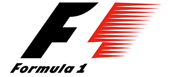
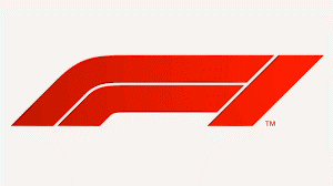
The iconic old design had been around since 1987 and was loved by F1 fans. With its stylised ‘go-faster’ stripes, it shouts SPEED!. The new one was immediately slagged off on Twitter as “a soulless doodle” and “a cold calculated roadway symbol”.
Why change at all?
Formula One’s new owners, Liberty Media, want everyone to notice the change. Their plan is to reach an even bigger and wider audience, making it not just a sport but “a media and entertainment brand”. The change is all about business, and merchandising in particular. The old logo was impossible to embroider and difficult to use digitally, the new one is much more practical.
Whatever your first impression, it’s probably best to get used to it.
Old F1 Logo:

New F1 Logo:


